

Showing posts with label dezyne. Show all posts
Showing posts with label dezyne. Show all posts
11/25/10
fedrigoni papers.
 Tags
dezyne
Tags
dezyne
5/21/10
dezyne. thirtyfive. nilla wafers.
 Tags
dezyne
Tags
dezyne
3/1/10
dezyne. thirtyfour. chiquita.
So Chiquita has come out with a new campaign and it fits perfectly with whats going on in viscom and the reading we just did about generating and culling your ideas.


This brand refresh was done by DJ Neff(creative director) and his staff at Neff Ink. Their main focus were the iconic blue and yellow stickers found on every Chiquita banana and how they could update them. They created a new set of icons from the basis of the original set. They immersed themselves in the culture and brand and took in as much knowledge that they could and then they "let it all spill out in different ideas, drawings, sayings, photographs, then start to figure out truths." He went on to say,"These truths all stem from the product and work outward, pulling from research and ideas to build upon the foundation, laddering up to a big idea." What he was saying directly correlates to the icon assignment we, as sophomores, are currently tackling. We have been pushed to produce(or at least we should have been) as many different ideas, drawings, styles, colors as we can to help ourselves in this process of creating our icons. We can only produce the best icons possible if we produce the maximum amount of them to make sure we exhaust all of our possibilities.
 So they took the iconic blue and yellow sticker with the woman wearing the fruit hat and turned it into a line of characters and above is the set of all of them. I love love love this concept so much. And they did it so very smoothly as well. All of the icons fit so well together yet they span such a wide array of faces. The same thing that some of us are struggling with when it comes to our icons, cohesion. It takes a certain level of skill to fully pull off cohesion successfully.
sources: design:related, neff ink.
ABOUT THIS POST. This post has been a work-in-progress for the past week... and tonight i finally got the chance to finish it... so that being said, this had the potential to be a much stronger post but that week break from it kind of killed it...

sources: design:related, neff ink.
ABOUT THIS POST. This post has been a work-in-progress for the past week... and tonight i finally got the chance to finish it... so that being said, this had the potential to be a much stronger post but that week break from it kind of killed it...
Tags
dezyne
2/20/10
dp. thirtythree. josef albers.
Speaking of AisleOne here is a post about something they featured. This is Josef Albers. We(us sophomores, at least) all know Josef Albers all too well from Terri's Color Drawing & Form class last semester. However, those weren't the only things he did in his life time. He also did album covers:

And this is just one example of a larger set of covers that he did. They are all quite magnificent(I would say wonderful but I've been forbidden to say that word, I've been told to update my vocabulary). They totally hark back to his color studies that he did, but they are still gorgeous in their own right. Follow the link above or below and there a more of them for you to gawk at. They have nice color palettes and the layouts are also very pleasing. Take a look at them, you'll be happy.
Tags
dezyne
DP. 32. Aisle One.

On another note, I want to change the name of these blog posts from "daily post" because they aren't daily any more(i am working on this, however every day will probably almost never happen until summer) I want to update the name but I don't know what to label these as. Any ideas?
ps. my blog can now be found on the right-hand side bar here.
sources: aisleone.
Tags
dezyne
2/3/10
DP. 31. Paul Rudolph Drawings.
Love love love love love Paul Rudolph and his amazing drawing style.

 Paul Rudolph was an architect living from the late 1910's to the late 1990's. His work has a very modernistic feel to it and the way he rendered his work on paper was very forward and new back then. He pushed the boundaries of how people rendered their work. I know this isn't a graphic designer, but he is a designer, and I love linear work. Lines are some of my favorite things(that and geometric shapes). Paul Rudolph's work is some of the most gorgeous linear work that I have seen since one Monsieur Frank Llyod Wright. Bask in his amazing artwork on the pages that the sources take you. You must delve deeper into this man's work. It makes me very happy.
sources: grain edit, the paul rudolph foundation.


sources: grain edit, the paul rudolph foundation.
Tags
dezyne
2/1/10
DP. 30. Borja Bonaque.
Yes, I know I've already done one blog post today, but I meant to blog about this yesterday(i think), but I never got around to doing it, so I thought tonight would be the perfect night to catch up on some much needed blogging/inspiration.
This artist's name is Borja Bonaque. Get acquainted with his work.

 He is a graphic designer from Spain. His work is a wonderful mesh of geometric, grunge, retro, classy. However, all his work may be amazing, but what I am going to focus on is his Duet Type typeface.
 This is quite the exceptional piece of typography here. I have an appreciation for many different styles and types of design. But my one, true love is typography so I tend to be waayyyyyyyyy overly critical of type face choices on anything and everything. This, however, is quite wonderful, but that doesn't mean that I'm going to let it off easy. There are still some quirks about it that annoy me. First and foremost is that "I" and how it is the only letter that isn't technically uppercase. There are some weight balance issues in when the crossbar connects to the stem it gets a little wonky in weight when curving from thin outward. Though one thing that I much appreciate is that the "W" and the "M" are the exact same shape just rotated. It's a very calligraphic element of this typeface(if the harsh thin thin and bold thick thick wasn't calligraphic enough for you). I'm drawn to the very structured aspect to this font but yet it still has subtle fleur details. Curved edges and curly circles at the end of some of the strokes. Not too overly rigid.
sources: grain edit, borja bonaque.
This artist's name is Borja Bonaque. Get acquainted with his work.


sources: grain edit, borja bonaque.
Tags
dezyne
DP. 29. Kix Cereal.
Kix cereal was introduced in 1937, that's 73 years ago. The box has gone through many different stages in those past 73 years. Here are two of my favorite, more boxes are linked to in the sources below.

 Vintage always seems to end up being much, much prettier than whatever the hell is out now-a-days. Kix has just recently released new packaging for it's cereal box and I'm just not feeling the change.
Here's what the box before looked like:
 Yeah, okay, it was running rampant with too many strokes, gradients, and oddly ballooned text. But, at least it was playful, young, and full of spunk, everything that Kix cereal should be seeing as it is targeted as a child's cereal(though I'm now 20 and I'm still in love with it). The new packaging seems more targeted towards the parents(mothers) of the children. When I was a kid, I didn't want anything to do with anything vegetable related. But that's part of the main focus of this new packaging. Healthy.
 Okay. The packaging isn't horrific, it's actually quite nice, but it would function a whole heck of a lot better if it wasn't on a Kix cereal box. It's too tame and too much reliant on the healthy symbol of eating popped corn(isn't that what Pops Cereal is, anyways?). I liked how Kix and Pops stayed distant from each other even though they're essentially the same sort of cereal. It makes sense that the new packaging is trying to emphasize the healthiness of it seeing as everything is on a health craze now. Kix is just working on making their product relevant after almost 75 years in the business. It's a task that I'm sure is not easy, and was well thought out before implementing. I just wish they would have kept the playfulness of the old box still in this new design. Even just something as simple as the bouncing in of the dot into frame and onto the 'i'. Over all the rebrand is a nice refresh, just not appropriate for this cereal.
Oh and every once in a while big-named corporations come out with old-style vintage versions of their current products for a limited time, and this is just a pure treat in my eyes. It gives me hope that people still know what good design is.

sources: theimaginaryworld.com, gentle pure space.


Here's what the box before looked like:


Oh and every once in a while big-named corporations come out with old-style vintage versions of their current products for a limited time, and this is just a pure treat in my eyes. It gives me hope that people still know what good design is.

sources: theimaginaryworld.com, gentle pure space.
Tags
dezyne
1/30/10
DP. 28. The Pew Center.

The logo for The Pew Center for Arts & Heritage is what's pictured above. It definitely has a lot going on within itself. There are 8 different colors within this design, 7 for the different initiatives and the 8th one is for the city of Philadelphia itself. Honestly, the colors scare me(and by 'scare me' I mean they aren't the most aesthetically pleasing colors ever chosen by man). In some ways I feel that there are way too many different colors going on within this logo but the concept behind it is fairly nice. However, I feel that the execution behind it could have been refined even more.

Though, after all is said and done, I do enjoy this new identity much more than what originally was put in place.
SOURCES: UNDER CONSIDERATION, JOHNSON BANKS.
Tags
dezyne
1/28/10
DP. 27. Cielo.

Today's find is Cielo, one of the largest payment networks in the world. It's largest market being Brazil. Cielo was originally called VisaNet. However, come June of this year, they will be handling more than just Visa. So, to help keep confusion down they decided an altered name was in order.
I definitely enjoy this branding much more than VisaNet. VisaNet was boring and the colors very unoriginal. Cielo's branding is definitely more modern, open, and more room to breathe. Which is good seeing as Cielo means sky in Spanish. BrandNew does point out that it has some odd angles and varied widths that make it a little shaky. However, getting past those facts, it's still quite refreshing. The light blue with dark gray isn't anything overly new, but it has always been a color combo that I enjoy. I'm curious as to why they decided to chop up certain letters the way they did. Other than that I am pretty pleased with this latest find.
Tags
dezyne
1/26/10
DP. 26. Sherlock Holmes.
Today it is the gorgeousness that is the Sherlock Holmes end credits.

Clicking on the image above will take you to the website that has the end credits clip. It is a very gorgeous piece of artwork, these credits. A nice addition to a period movie. If you have not seen Sherlock Holmes, well you'll have to wait until it comes out on DVD, but for those who have seen it, it really helps keep the mood of the movie going. The movie was a period-piece. Half the time I was too distracted by the costumes, sets, and backgrounds to keep my mind on the movie. But, the credits were also a very nice touch. The way the credits go from film strip to having the watercolor and ink soak into the screen and then get extracted back out is a very gorgeous effect.
SOURCES: ART OF THE TITLE.
SOURCES: ART OF THE TITLE.
Tags
dezyne
1/25/10
Daily Post. 25. Doritos.


The collaboration comes into play with that last bit. If you go to his Behance Gallery, you can download a template to design your own graphics to go into the triangles. Anybody can submit ideas and the wider variety of designs the better it can only get. This concept is actually really quite a wonderful one. Ideas like this have been done before with Pepsi and other soda products that let consumers submit their own can designs and then the best were picked out and they mass-produced them.
I will most definitely look into designing some triangles for this project and I think that everyone who sees this should also consider designing for the project as well. Why not? It's an easy way to get your name out there and who knows what could end up happening with this project? Your designs being mass-produced for the entire consumer population to see? Not badddd.
SOURCES: THE DIELINE, BEHANCE.
Tags
dezyne
1/23/10
Daily Post. 24. (un)Real Reality UPDATE.
The Third & The Seventh from Alex Roman on Vimeo.
I am updating about the post that I made a few weeks back about an artist named Alex Roman and the 100% CG movie that he was creating. Well the movie is finally done and I am here to show it to you all and let you salivate over it for the full twelve and half minutes. Tho you should make it full screen before you watch to get the full effect. And to prove that this REALLY IS all CG built, below is the video of him working on the project. This movie is BEYOND outstanding and the entire piece, music and all, is done by one person. This was a solo project that he took on by himself.
Exeter Shot -- Making Of from Alex Roman on Vimeo.
This the making-of of the movie, it's astounding as to how well he knows all of these programs. In the sources below there are more videos of this project including one about the music from the movie, which he composed himself, as well.
SOURCES: THIRDSEVENTH(CURRENTLY DOWN FROM OVER TRAFFICING), VIMEO.
Tags
dezyne
1/21/10
Daily Post. 23. Jan Zabransky. Part2.
This is part two with Jan Zabransky.


SOURCES: JAN ZABRANSKY.
Tags
dezyne
Daily Post. 22. Jan Zabransky. Part1.
This is another two-post day, two stunning works by Jan Zabransky.

This is Coffee Cup. The concept is is very nice and very simple. The color palette is a pleasing mocha brown, which makes sense. The word cup is cleverly done but a little hard to read and if the person looking at it doesn't know that it should be Coffee Cup. Very organic, which I am starting to love more and more as time goes on.
SOURCES: LOGO OF THE DAY, JAN ZABRANSKY.

SOURCES: LOGO OF THE DAY, JAN ZABRANSKY.
Tags
dezyne
1/20/10
Daily Post. 21. Sorbonne Nouvelle.


SOURCES: BRAND NEW.
Tags
dezyne
Daily Post. 20. Towers Watson.
Two posts today. Totally forgot to do one yesterday. Both from Brand New, my favorite site.
This is Towers Watson. It is essentially an insurance company. It is the creation after two companies merged, Towers Perrin and Watson Wyatt Worldwide.

This is Towers Watson. It is essentially an insurance company. It is the creation after two companies merged, Towers Perrin and Watson Wyatt Worldwide.

This is a very nice Brand Identity. The typeface choice is rather nice to start off with. The slenderness of the typeface is well used. The name could have the potential to be obscenely long. The monogram is also a nice sight. It is a very nice, and very simple solution. Nothing too overly abstract, yet still has meaning behind it. The idea behind it being that Towers Watson is still a personable company, even though it may be a rather hefty-sized company.
Tags
dezyne
1/18/10
Daily Post. 19. Hanger Tea.
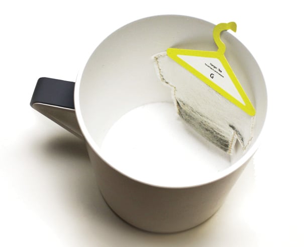

It’s a funny take on how the simple motion of hanging a used teabag on the rim of your cup, be done.The concept is very clever and very simple. Almost another one of those why did someone already think of that, ideas. Different colored hangers for different types of tea.
SOURCES: THE DIELINE.
Tags
dezyne
Daily Post. 18. Sweet.


SOURCES: THE DIELINE.
Tags
dezyne
1/16/10
Daily Post. 17. Chop Shop.
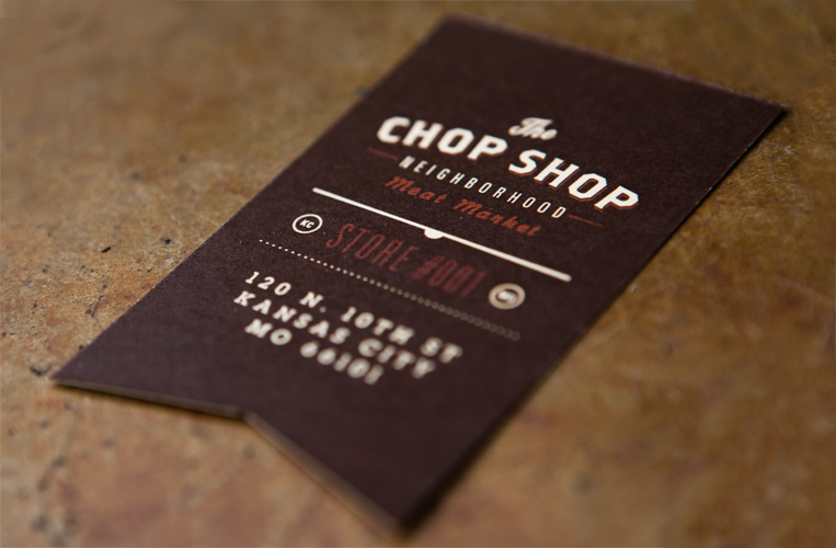
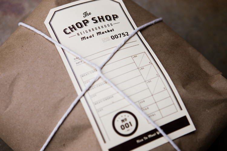
SOURCES: GRAPHIC-EXCHANGE.
Tags
dezyne
Subscribe to:
Posts (Atom)