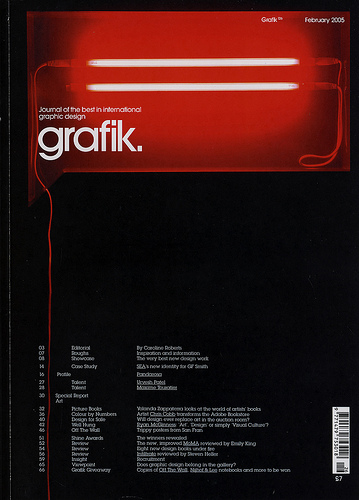
I love these magazine covers. The placement of everything is so very nice. The top has the logo, name placed inside of a speech bubble type shape. Then below it is a list of page numbers, section title, and quick description of that section. It's a beautiful layout. It's a very successful answer to the problem at hand. Plus, all of the magazine covers that I see now-a-days are way to over done, trying to grab your attention, but they are just so ugly. Seeing a magazine like this gives hope to my world that good design really does exist even in such a washed out market like magazines.
Below are links to the website of this magazine, the website I found this cover on along with more covers like it and the wonderful website called Graphic-ExchanGE.
SOURCES: GRAPHIC-EXCHANGE(ORIGINAL POST), GRAFIK MAGAZINE.

