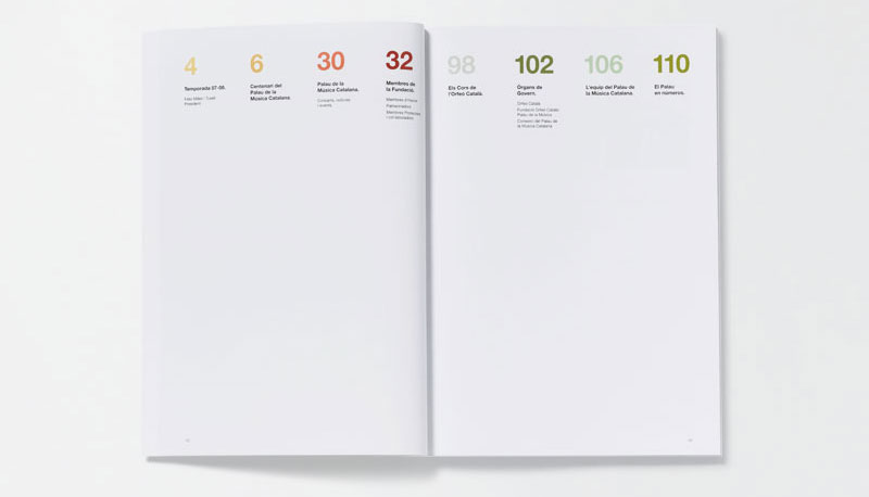
This post will be short. The layout of the table of contents is quite nice. It's a very simple grid with a nice hierarchy of the size of the numbers to the text below it. I looked through the website that this was pulled from, but I cannot find the original article. I would assume that the colors correlate to the different sections which is a simple, yet very successful way to section off information within the book. Plus, my favorite type of design. Clean, simple(at first glance), and successful.
SOURCES: FFFFOUND!, GRAPHIC-EXCHANGE(WHERE ORIGINALLY SPOTLIGHTED).