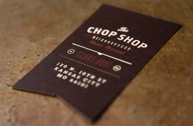
Loving the throwback. My favorite type of design, the less-is-more motto. The wonderfulness of simple cursive-style fonts is refreshing to see. The two color design aspect is very nice as well, cheap(er) for printing. Not to mention that they're located in Kansas City! Fits the atmosphere of KC pretty well. The whole pork, barbecue, meat air of this city. But not only is the logo nice but all of the packaging as well.
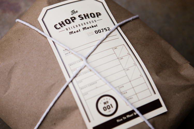
Love the info tags that just slip right down under the tie string. More images in the sources below.
SOURCES: GRAPHIC-EXCHANGE.