
Branding Style #01: Mobile Apparatus
This is the first direction that Taylor and I discussed. This idea of the mobile and how information that's more active would weigh more, visually. So, topics that are discussed more hang lower than the topics that are discussed less. When you get farther down into the content, you move farther down the mobile. I love this concept, however, I'm struggling to get the visuals to look nice. Right now, it still feels gimmick-y, and that is the LAST thing i want this to look like.

the main page of the hub
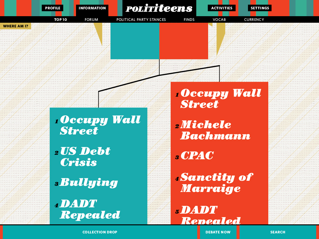
the overview view of the top 10 current topics under the information tab
Branding Style #02: Circle Dive
Honestly, I feel like I really had an epiphany with this direction. You navigate inside the circles, so when you click on a circle you move into it, diving deeper into the subject to get a deeper, more detailed view of the topic. All of the kinks aren't fully worked out, but I feel like this works much better already visually than the first direction.

the main page

the information main page, inside of the information circle from the screen above

the top 10 main page, inside the Top 10 circle from the screen above

here is the conservative page as it looks within the conservative circle from the screen above.

Here's the page if you hover your cursor on the top conservative topic. in the blue circle in the lower right-hand corner, the corresponding number topic of the liberal side shades over and has a "1" put on top of it.
As of now, I'm really leaning towards the second direction(circle dive). Conceptually it makes clearer sense than the first direction(mobile apparatus). Visually its much more cohesive, less gimmick-y, and already so much more refined than the first direction.