
1/30/10
DP. 28. The Pew Center.
The logo for The Pew Center for Arts & Heritage is what's pictured above. It definitely has a lot going on within itself. There are 8 different colors within this design, 7 for the different initiatives and the 8th one is for the city of Philadelphia itself. Honestly, the colors scare me(and by 'scare me' I mean they aren't the most aesthetically pleasing colors ever chosen by man). In some ways I feel that there are way too many different colors going on within this logo but the concept behind it is fairly nice. However, I feel that the execution behind it could have been refined even more.

Though, after all is said and done, I do enjoy this new identity much more than what originally was put in place.
SOURCES: UNDER CONSIDERATION, JOHNSON BANKS.
1/28/10
IMAGE. ReadingOne. Semiotics.
While reading the pdf, I had kind of a break through while reading this quick little article. I understand what icon is, that is a very straight forward idea. An icon is something that looks like what it is trying to represent, but it isn't that object. It is just pencil on paper, or just light on a wall. Index is something correlates directly back to the object. A footprint on the ground correlates to a shoe/foot. Smoke correlates directly back to a fire. A symbol, however, is something that functions through agreed rules(taken directly from the reading). That one little phrase made symbol click in my head. However, now figuring out which ones are through agreed rules is the struggle.
TYPETWO. ReadingOne. Type Image Message.
Putting type and image together is something that all designers(supposedly) think, breathe, and dream all the time. It is something that we all face and something that challenges us all. Type exists in black and white area whereas image exists in a much more gray area. When putting those two together it makes the viewer have a harder time understanding the information in front of them. The text is more straight forward and the image makes the viewer think more about what is trying to be conveyed across to the viewer. Though there are different ways that type and image go together and depending on those ways, the viewer understands the relationship differently.
DP. 27. Cielo.
Today's find is Cielo, one of the largest payment networks in the world. It's largest market being Brazil. Cielo was originally called VisaNet. However, come June of this year, they will be handling more than just Visa. So, to help keep confusion down they decided an altered name was in order.
I definitely enjoy this branding much more than VisaNet. VisaNet was boring and the colors very unoriginal. Cielo's branding is definitely more modern, open, and more room to breathe. Which is good seeing as Cielo means sky in Spanish. BrandNew does point out that it has some odd angles and varied widths that make it a little shaky. However, getting past those facts, it's still quite refreshing. The light blue with dark gray isn't anything overly new, but it has always been a color combo that I enjoy. I'm curious as to why they decided to chop up certain letters the way they did. Other than that I am pretty pleased with this latest find.
VISCOMTWO. ReadingOne. How to Think.
Ed Boyden makes some pretty good points in that blog. His idea of never read passively was something that I actually spent time working on over break. Always be taking in information while you read. Learn how to take those ideas and apply it to what you already know. Also, the idea of drawing big is definitely something Jamie taught us at the beginning of last semester, but I seemed to stop using, though picking that back up probably would be a pretty good idea. All of the things that were in that article are very useful, but the thing that really stuck out to me the most was to take risks. You'll never know what you can't do until you try it. So try things, take risks, do something that you wouldn't normally do.
SOURCES: TECHNOLOGY REVIEW.
SOURCES: TECHNOLOGY REVIEW.
1/26/10
Blog Updates.
Dunno how I feel about these changes. I like the banner, but I'm still iffy on the color scheme...honest opinions?
TYPETWO. Change One Thing.
I don't want to be the cliche gay designer who always is speaking out for everything to do with gay rights, but in all honesty, that really is a big part of what I'm about. And it's not even necessarily that it's all about gay rights, but about equal rights, for everyone. The topics that I have chosen are either topics that have affected me personally, or ones that I just strongly believe in.
- Take homosexuality off Red Cross's permanent red list
- AIDS awareness for straight couples
- Take 30 minutes a day to exercise
And so the sketching commences.
DP. 26. Sherlock Holmes.
Today it is the gorgeousness that is the Sherlock Holmes end credits.

Clicking on the image above will take you to the website that has the end credits clip. It is a very gorgeous piece of artwork, these credits. A nice addition to a period movie. If you have not seen Sherlock Holmes, well you'll have to wait until it comes out on DVD, but for those who have seen it, it really helps keep the mood of the movie going. The movie was a period-piece. Half the time I was too distracted by the costumes, sets, and backgrounds to keep my mind on the movie. But, the credits were also a very nice touch. The way the credits go from film strip to having the watercolor and ink soak into the screen and then get extracted back out is a very gorgeous effect.
SOURCES: ART OF THE TITLE.
SOURCES: ART OF THE TITLE.
1/25/10
VISCOMTWO. Icon List.
GOING FOR GOLD
speedo
goggles
swim cap
starting block
whistle
splash
water
lane lines
stop watch
flags
medal
towel
TO WOO HER
shower
dress
pots
pasta
plates
utensils
doorbell
candles
rose
kiss
dress
pillows
speedo
goggles
swim cap
starting block
whistle
splash
water
lane lines
stop watch
flags
medal
towel
TO WOO HER
shower
dress
pots
pasta
plates
utensils
doorbell
candles
rose
kiss
dress
pillows
Daily Post. 25. Doritos.


The collaboration comes into play with that last bit. If you go to his Behance Gallery, you can download a template to design your own graphics to go into the triangles. Anybody can submit ideas and the wider variety of designs the better it can only get. This concept is actually really quite a wonderful one. Ideas like this have been done before with Pepsi and other soda products that let consumers submit their own can designs and then the best were picked out and they mass-produced them.
I will most definitely look into designing some triangles for this project and I think that everyone who sees this should also consider designing for the project as well. Why not? It's an easy way to get your name out there and who knows what could end up happening with this project? Your designs being mass-produced for the entire consumer population to see? Not badddd.
SOURCES: THE DIELINE, BEHANCE.
1/23/10
Daily Post. 24. (un)Real Reality UPDATE.
The Third & The Seventh from Alex Roman on Vimeo.
I am updating about the post that I made a few weeks back about an artist named Alex Roman and the 100% CG movie that he was creating. Well the movie is finally done and I am here to show it to you all and let you salivate over it for the full twelve and half minutes. Tho you should make it full screen before you watch to get the full effect. And to prove that this REALLY IS all CG built, below is the video of him working on the project. This movie is BEYOND outstanding and the entire piece, music and all, is done by one person. This was a solo project that he took on by himself.
Exeter Shot -- Making Of from Alex Roman on Vimeo.
This the making-of of the movie, it's astounding as to how well he knows all of these programs. In the sources below there are more videos of this project including one about the music from the movie, which he composed himself, as well.
SOURCES: THIRDSEVENTH(CURRENTLY DOWN FROM OVER TRAFFICING), VIMEO.
1/22/10

1/21/10
Daily Post. 23. Jan Zabransky. Part2.
This is part two with Jan Zabransky.

SOURCES: JAN ZABRANSKY.
Daily Post. 22. Jan Zabransky. Part1.
This is another two-post day, two stunning works by Jan Zabransky.

This is Coffee Cup. The concept is is very nice and very simple. The color palette is a pleasing mocha brown, which makes sense. The word cup is cleverly done but a little hard to read and if the person looking at it doesn't know that it should be Coffee Cup. Very organic, which I am starting to love more and more as time goes on.
SOURCES: LOGO OF THE DAY, JAN ZABRANSKY.

SOURCES: LOGO OF THE DAY, JAN ZABRANSKY.
1/20/10
Daily Post. 21. Sorbonne Nouvelle.
SOURCES: BRAND NEW.
Daily Post. 20. Towers Watson.
Two posts today. Totally forgot to do one yesterday. Both from Brand New, my favorite site.
This is Towers Watson. It is essentially an insurance company. It is the creation after two companies merged, Towers Perrin and Watson Wyatt Worldwide.

This is Towers Watson. It is essentially an insurance company. It is the creation after two companies merged, Towers Perrin and Watson Wyatt Worldwide.
This is a very nice Brand Identity. The typeface choice is rather nice to start off with. The slenderness of the typeface is well used. The name could have the potential to be obscenely long. The monogram is also a nice sight. It is a very nice, and very simple solution. Nothing too overly abstract, yet still has meaning behind it. The idea behind it being that Towers Watson is still a personable company, even though it may be a rather hefty-sized company.
1/18/10
Daily Post. 19. Hanger Tea.
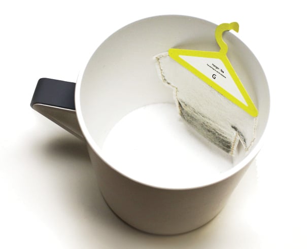

It’s a funny take on how the simple motion of hanging a used teabag on the rim of your cup, be done.The concept is very clever and very simple. Almost another one of those why did someone already think of that, ideas. Different colored hangers for different types of tea.
SOURCES: THE DIELINE.
Daily Post. 18. Sweet.


SOURCES: THE DIELINE.
1/16/10
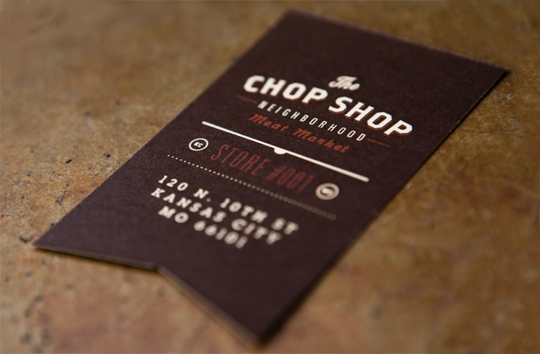
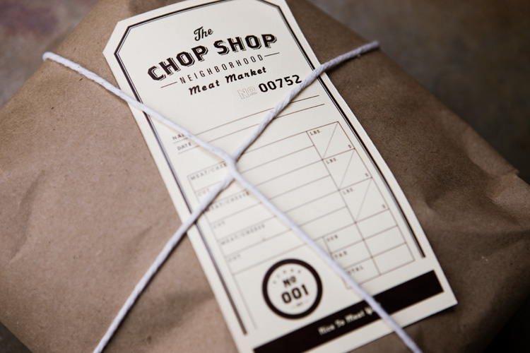
Daily Post. 17. Chop Shop.
SOURCES: GRAPHIC-EXCHANGE.
1/15/10
Daily Post. 16. Experimentation. Part Trios.
So these past two posts have all lead up to part of what I am planning on focusing on this coming semester. Experimentation. Experimentation of different styles of design. I am someone who is absolutely in love with the world of good design, but doesn't fully know where my heart truly lies. Is it with modernism? Postmodernism? Minimalism? Is it highly inspired by 80's design? Is is very old-world inspired?
I honestly can't fully answer that right now.
But, that is partly why I am here, going to this amazing(yet mentally insane) school. Trying to figure this and pretty much everything else out. How to create successful websites, print spreads, etc.
One area that I really want to focus on is my style. I plan on get my taste buds watering over a platter of many different styles of design to see which styles tickle my fancy over other styles. I also plan on changing the scheme of my blog to match the style of design I am playing with at the time. Alllll of this in hopes of me finding a more definite personal way in the design world.
Right now, my latest intrigue is 1908's style. Geometric shapes and bright colors. I always say that I love geometric shapes(which I whole-heartedly do) but they very seldom show up in my work. I plan on playing around with this more in the coming weeks. I will updating the blog in the next few days to be an explosion of 80's. Think you can handle?
Here's to a brand new start in the spring semester!
Daily Post. 15. Tracasseur. Part Deux.
Part two of the three post series. This one focuses on the website Tracasseur and their gorgeous banner. 80's inspiration all the way.

I was chatting with Keaton at like 2 o'clock this morning over ichat while working out and we were sharing in some lovely design and type work. One thing that I found last night was this amazing banner from a website called Tracasseur. The abstraction of the letters being built by the different colored shapes and the inherent lines between the shapes is really very wonderful. Not to mention the colors of it are very quite nice.
SOURCES: TRACASSEUR.
SOURCES: TRACASSEUR.
Daily Post. 14. City of Melbourne. Part Un.
Hmmm, where did the past two weeks go? Busy slash a case of the lazies. I'm back with two new identities that I love. Both inspired by 1980's goodness. This is the first of a three post series. This first one is for the City of Melbourne.

This was the old identity. Nothing absolutely amazing, and yet nothing absolutely amazing. The colors are boring, a medium gray and yellow. Plus there is just too much going on within this. "city of Melboyrne" plus their logo/branding column, leaf, sun thing was just too much.

Their new branding is so very much better in sooooo many ways. Here are a few links to more information about this identity. Overall the new identity is much better. It has been simplified down to "City of Melbourne" and a multipurpose capital letter "M". In the links above they have all different iterations of how the M can and will be used throughout the city, television, and print media. Everything down to even the tickets the police give out were updated to help bring the city of Melbourne to year 2010. It's very modern and up-to-date compared to their old identity.

The use of not only the M but the grid of triangles it sits on(and is made up of) throughout print media is very nice. The incorporation of the triangles add another layer to help boost imagery to bring it up-to-date with the rest. Something so simple as multi-colored triangles.
SOURCES: BRAND NEW, LEVELELEVEN, CITY OF MELBOURNE.
SOURCES: BRAND NEW, LEVELELEVEN, CITY OF MELBOURNE.
Subscribe to:
Comments (Atom)