This is another two-post day, two stunning works by Jan Zabransky.
This is Coffee Cup. The concept is is very nice and very simple. The color palette is a pleasing mocha brown, which makes sense. The word cup is cleverly done but a little hard to read and if the person looking at it doesn't know that it should be Coffee Cup. Very organic, which I am starting to love more and more as time goes on.
SOURCES: LOGO OF THE DAY, JAN ZABRANSKY.
1/21/10
1/20/10
Daily Post. 21. Sorbonne Nouvelle.
So, this is the University of the New Sorbonne Paris3. It is the third or six universities, hence the 3. This new identity is a much welcomed change from it's original identity(i chose not to display it for a reason). The identity has been greatly improved but it is still lacking solidity and originality. The typeface choice is a nice selection, echoing its longer history. But the colors and the abstract shape are a welcomed sight, but could have been pushed, like everything else about this branding. The abstract shape representing multiple ideas. But the shapes are a little awkward, almost razor-like. Some of the shapes get a little too tiny, along with the top and bottom text. When it sizes down, they alter the sizing of the smaller text so it still comprehendible, but in true good design, that should not have to happen. The branding feels safe, it doesn't feel like it was pushed far enough, but it sure is a welcomed sight from its original branding.
SOURCES: BRAND NEW.
SOURCES: BRAND NEW.
Daily Post. 20. Towers Watson.
Two posts today. Totally forgot to do one yesterday. Both from Brand New, my favorite site.
This is Towers Watson. It is essentially an insurance company. It is the creation after two companies merged, Towers Perrin and Watson Wyatt Worldwide.
This is a very nice Brand Identity. The typeface choice is rather nice to start off with. The slenderness of the typeface is well used. The name could have the potential to be obscenely long. The monogram is also a nice sight. It is a very nice, and very simple solution. Nothing too overly abstract, yet still has meaning behind it. The idea behind it being that Towers Watson is still a personable company, even though it may be a rather hefty-sized company.
1/18/10
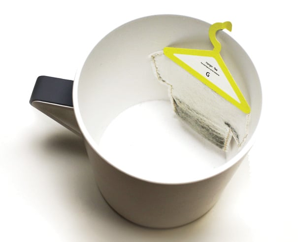
Daily Post. 19. Hanger Tea.
This is one of cutest designs that I've seen in a really long time. It is a very cute idea. Quote from the designer:
SOURCES: THE DIELINE.
It’s a funny take on how the simple motion of hanging a used teabag on the rim of your cup, be done.The concept is very clever and very simple. Almost another one of those why did someone already think of that, ideas. Different colored hangers for different types of tea.
SOURCES: THE DIELINE.
Daily Post. 18. Sweet.
This is the packaging for a baking company called Sweet, and the packaging for it is absolutely adorable. the color palette is quite superb. the light baby blue, salmon, creme, and dark brown is a wonderful combination and I have actually used the blue/creme/brown combination before in designing of my personal website.
their branding is also really very cute. a mixture of different color combinations in the shape of a flower/sun. very simple, but effective. the cursive 's' in sweet is a nice simple touch but it feels kind of out of place when the rest of the word is in script(not cursive).
SOURCES: THE DIELINE.
their branding is also really very cute. a mixture of different color combinations in the shape of a flower/sun. very simple, but effective. the cursive 's' in sweet is a nice simple touch but it feels kind of out of place when the rest of the word is in script(not cursive).
SOURCES: THE DIELINE.
Subscribe to:
Posts (Atom)