10/30/09

TYPE1; Bromine; Final Monogram

Click here for the original hand-drawings that inspired these three sets of digital drawings.


In the set above, I focused on three different pairings of the letters "b" and "r" picked out by my studiomates and teacher in class. These are three sets of iterations of the three different designs. The boxed monograms are the two chosen for me to elaborate on.


This stage I focused on the two ideas and created many an iteration. I leaned towards the bottom idea more than the top. I felt I had more room for creativeness in the bottom one. Yes the top one is more compact, but I preferred the bottom one. I felt the top one didn't give me as much room for creative freedom. The one highlighted one is the one I built upon even more.


Bromine is only one of two elements on the periodic table that is a liquid at room temperature. I wanted to play off of this fact as much as possible and even though the lowercase b has the stem, I wanted to play off of the bowl of the sans serif "b" (DIN Schriften Std) and the ear of the serif "r" (ITC New Baskerville Std) how both of those are very curvy, fluid forms. I also liked the juxtaposition of the sans serif "b" with the serif "r". It gave the "r" more of a importance against the "b". It gave more weight to the r that it didn't just look like an odd decorative element to the "b".

At the bottom of this post is the final monogram for my element, Bromine. This is the final of many different iterations of this form.

After finishing this monogram, it reminded me of a designer my friend showed me a longgggggg time ago. His name is Fabien Barral and he is a graphic designer in France. His work is veryyyyy organic with almost 100% all serif fonts in his work. There is a wonderful mix of clean typographic and logo-work paired with a very organic grunge/fluidity. The simplest way to put his work, is elegance at it's grungiest finest. I am in love his work, and in looking at my monogram, it reminded me of the work that he has done.

10/26/09

VISCOM1; Haiku & Words

Butterfly asleep
Folded soft on temple bell
Then bronze gong rang!


Butterfly asleep;
  1. butterfly
  2. sleep
  3. night
  4. calm
  5. quiet
  6. summer
  7. breeze
  8. cool
  9. resting
  10. serene
  11. delicate

Folded soft on temple bell;
  1. fold
  2. soft
  3. bell
  4. temple
  5. holy
  6. cloth
  7. warm
  8. sun
  9. lay
  10. relax
  11. iron
  12. large
  13. miniscule

Then bronze gong rang!;
  1. bronze
  2. metal
  3. gong
  4. vibrate
  5. scare
  6. wake
  7. alarm
  8. scatter
  9. flutter
  10. beat
  11. solid

10/25/09

CD&F; October 18-24


This week started the color section of this class. We have started to delve into color studies. the basics of these being a 20 piece color wheel using our Color Aid that we purchased. Color Aid being individual pieces of paper screen-printed with an array of pure colors. With our Color Aid we created our color wheel picking out the appropriate colors with our eyes as our guide.

10/21/09

VISCOM1; Proj2 Reading Response

Framing was a critical role in the creation of this line book. Through framing of the images, we created the successful juxtapositions.  The way I framed something to give it an appearance of something something bigger, something that felt to extend farther than what it actually did to hep create certain juxtapositions. When working with continuation from one image to the next, framing was critical to draw the eye across the spread or any other direction needed to make the continuation successful.

Even though I don't feel that in my book I was focusing on positive and negative space directly, it is impossible to not think about it. When working with straight black and white you have to think about what is more dominant in the image or drawing. Being able to clearly show one dominant over the other is crucial to be able to get your point across successfully.

CD&F; Color Book Ideas

Clothing

I would take photos of different outfits with different color schemes. I could go a few different ways with this one. I could have all of the clothes modeled by the same person, someone that I know, maybe even myself. Or I could go out on the streets and find people with nice color schemes. I could also use my friends as models and have all my friends each wear a different color scheme made up of colors from their wardrobe. This could, and would, also incorporate the background colors to help with the over-lying color scheme of the images.

Ties & Suspenders

I own a heck of a lot of ties and suspenders, I could incorporate ties and suspenders into a neutral-based outfit like black shirt and jeans, or white shirt, or some shade of gray shirt. But then focus on the ties and suspenders making the color schemes, along with the background color(s).  This one probably would be a bit harder to pull off, but I really like this idea.

Books

I am not an avid book reader, but now-a-days I love to look at books, and their covers and the text inside. Pretty much every graphic design and typographical aspect of the book. But books can have gorgeous covers. I would not be able to use all the books that I have because I do not have enough books to do this, but Barnes & Noble sure does. That may be a little hard to be able to pull off, however.

VISCOM1; Line Book; Sequential Process


The hand-generated curved line studies were a very difficult process for me grasp well. Even once I was ready to turn them back over to the computer, I realized I still have much refinement to make to my line quality. Hand generating these lines first really did help me understand these line studies better. Made me realize why the line studies worked the way they did, from the angle of the curve, to how big it was. Even a very slight angle change could make a generated line study match or not match a photograph successfully.

Also, it is not possible to get very nice, controlled, curved lines from a computer generated image. Computers are not sophisticated enough(yet anyways) to be able to handle such delicate tasks, it is too clunky. That is where the hand and eye come into play to create the perfect curve. Once the curve is created by the hand on paper with pencil, it can then be put into the computer to be digitally reproduced. However, it will still be drawn by hand, just through the computer.

Line control with my pencil is a very hard thing to grasp. I am a sketcher, my lines have nice curve quality to them, but I need to work on my line quality more, even after this exercise. This has started me on the right path, but more work really needs to happen.

VISCOM1; Line Book; Final Statement

Streetviews


Streetviews is the name of my line study book.  Below is what is printed on the cover of this book:


Kansas City is full of bustling streets and busy offices, it never slows down. I have come to enjoy taking walks around the city taking time to slow down, take a breath, and escape from my everyday tasks. In doing this, I have come to find there are innumerable parts of this city that are stunningly gorgeous. Everything from the office buildings in the business district, the apartment buildings on the plaza, art pieces strewn throughout the city, sewer covers on the streets, and metal workings showing through the concrete on the sidewalks. All of these pieces share one thing in common, the lines within them. They are all made up them, all in different ways, and all have different tasks. Everything is comprised of lines and it just takes a keen eye to be able to find all of these treasures.


The beginning of this project we started with basic line studies representing balance, progression, and randomness.

From here we combined the line studies to make complex line studies. With these combined line studies we were still required to show the three different ideas of balance, progression, and randomness.

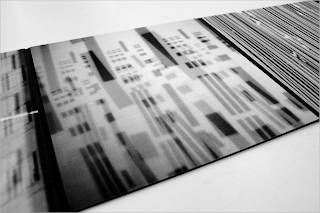
From all of these computer-generated line studies, we hand-manipulated them with photocopiers, scanners, and projectors. At this point we could put the three ideas aside and focus on creating nice curved and diagonal line studies. From these new studies would come the three original ideas again.


From this point in the process, we took all of those generated line studies and we went into the real world of Kansas City and photographed our surroundings. We were supposed to find the line studies we created in the studio out in the real world. I took hundreds of photos over a week in the plaza, crown center, crossroads, business, and river market areas. Of these photos, I was trying to find pre-existing line studies in the community of Kansas City that mimic the line studies that I created in the studio.


 Once we had our pictures we went back into the studio to create our juxtapositions. We started working with matching up line studies with photographs to create successful pairings that went logically together. We worked with mirroring the two, continuation from one into the other, and echoing of the two.


The line studies that I created at the beginning were rather simple, rather minimalistic. This made the creation of the complex line studies harder, as well as finding line studies in the real world harder to capture. In my photos I was focusing on buildings and close-ups of objects along the streets. I wanted to focus on the area of Main Street, and all of the different places and objects you can see in the different districts that are located off of Main Street. This took me everywhere from the Plaza, to the River Market.


Working with the photocopier, scanner, and projector really helped with the curved and diagonal line studies. It made me realize that the computer cannot do everything, like I once thought. It, too, is limited in what it can do. Using hand-generated tools to create these things were very much more successful. Even the hand is more successful in creating nice controlled curves than the computer sometimes.

In my book, I worked with a pattern of ABBABBAAB in that A was a building(or a bigger object) and B was a close-up shot of something located directly on the streets and sidewalks. Within that setup, I also worked with trying to match up densities of blacks, whites, and grays to make it a nice transition on the eyes from image to image and spread to spread.

10/20/09

VISCOM1; Scher Video

Scher lives in New York City, and the style of design that she does is very crowded, squished, very thin and vertical. Her design style is influenced by the city she lives in, by what surrounds her. It is interesting to see how the city that she has lived in for so long has affected the art she makes. I never fully thought about that aspect of design. Design affects its surrounds but the surroundings also affect the art that you put into it. 

The city I live in right now is Kansas City. The project I am working on right now is based on and influenced by Kansas City. Kansas City is a rather big city, but the nice part about it is that it may be big, but it's had the opportunity to grow outward instead of upward, like most big cities. This city isn't in as big of a metropolitan area as say New York or other big cities. My book showcases the many different aspects of Kansas City. Some pages house tall buildings, some pages house smaller objects like stuff on the street. It has to big city aspects, as well as the smaller aspects that this city has to offer that other big cities do not. My cover also reflects this. Kansas City has its fair share of sky-rise buildings, but it also has many gorgeous very old buildings. my cover is in the shape of a rather tall building, but not as thin or as tall as the usual sky-scrapers, but it shorter, and wider.

10/19/09

VISCOM1; F+S; update

Sooooooooooooo, I went to my apartment after class today to grab a shower(i woke up at 9 o'clock for my 8 o'clock class...) and make some lunch(at 3.30...) and in the process I pulled up fox.com to watch Glee. When I pulled up the website, I saw this amazingly gorgeous juxtaposition:

At first I thought it was done on purpose, but the more I thought about it the more I realized that it was probably completely by accident, pure serendipity. The images they put up there are the one image from each episode that best describes the episode or what best describes the caption, and these two work amaaaaaaaazingly well! This made me oh so very excited to see it. Obviously, the guy in the right picture is holding up a gun almost perfectly inline with the guy on the left in the bed. It also helps that the guy on the left in the bed is in a hospital bed and obviously hurt, this plays up the fact of getting hurt(by the gun, even though there is no gun wound to the head, obviously). Also, House's eyes are inline with the guy on the right giving him a look while the guy on the right yells back. I thought of Jamie the moment I saw this, oddly enough, i had to post this to my blog asap for her to see.

Design is taking over my life! LOVEIT.

VISCOM1; Cover Title Options


These are my first stabs at covers for my line book, named "Streetviews". We had to come up with six different ideas and these three are my favorite of the six+ that I had for class. I wanted something simple, small, and understated for my book, no overly huge text or put in any weird sort of way. I ended up going with the first of my ideas. The final cover is at the end of this blog. Below is the title and the text that lie on my cover.

Streetviews

Kansas City is full of bustling streets and busy offices, it never slows down. I have come to enjoy taking walks around the city taking time to slow down, take a breath, and escape from my everyday tasks. In doing this, I have come to find there are innumerable parts of this city that are stunningly gorgeous. Everything from the office buildings in the business district, the apartment buildings on the plaza, art pieces strewn throughout the city, sewer covers on the streets, and metal workings showing through the concrete on the sidewalks. All of these pieces share one thing in common, the lines within them. They are all made up them, all in different ways, and all have different tasks. Everything is comprised of lines, it just takes a keen eye, relaxed mood, and time to be able to find all of these treasures.

10/16/09

TYPE1; Elements; Bromine


These drawings above are my 30+ sketches of Bromine. Bromine's symbol is Br. These are the first 30+ rough sketches. We were required to work with combining the letters to make logo-type graphic drawings. The above images are of the original sketches of my element.


These, above, are my enlarged, refined sketches of Bromine's symbol. I picked out ten different drawings with Michael's help to blow up and refine. Then at the end of class the ones starred, along with the bottom left drawing are the three that I will reiterate five times each. I was working with combining the two letters to become one solid symbol. I focused on on the basic structure and connection of the letters and in my reiterations I will start working with different weights of the two letters trying to find the nice balance between the two. I will update this blog post sunday with my fifteen different iterations of BR.

About Bromine

Bromine was found by two separate chemists; Antuine Balard in 1825, and Carl Jacob Lowig in 1826. Balard accidentally discovered bromine while trying to create iodine. It was discovered in the ash of sea weed from Montpellier in the salts of the sea weed.  Lowig found bromine in mineral water from his hometown Bad Kreuznach. He used a solution of mineral salt saturated with chlorine to extract the bromine.

The main characteristics of bromine are dense, mobile, volatile, reddish-brown liquid. It evaporates easily to form a toxic, corrosive red vapor with a strong odor. It is slightly soluble in water and highly soluble in carbon disulfide, aliphatic alcohols, and acetic acid. The three main uses of bromine is used a bleaching agent, maintaining swimming pools, and as a fire retardant. It is only one of two elements liquid at room temperature. It is harmful for the ozone so it is slowly being phased out from most production processes.


CD&F; October 11-17


This week has been a week about wrapping up the extruded letterforms. We had photographs of our letters(or numbers) due wednesday trying to show four of the six contrasting elements in our forms. It was much harder than it sounded. Even after our second wave of critiques, I still have to go back a third time to reshoot photos to properly finish this assignment. My form, while being very dimensional and having manyyy possibilities, is still rather limited. The way I constructed this was a horrendous idea and it does not have the full range of motion that it has the capabilities to. Even after that fact, though yes it makes my job harder, it makes me become more creative and figure out ways to fulfill the assignment. It makes me have to work through situations differently than how I could if my project was up to my usual standards in craft. I have a busy weekend ahead of me, but this only makes em want to be even more creative in how I finish everything.

10/14/09

VISCOM1; F+S


This example of juxtaposition is quite nicely shown. What this poster is of exactly, I do not know, but the sense of progression is outstandingly strong. The lines on the woman's body create a very nice line study where the rest of them help echo the photo. It is also a nice random line study. This is nice to see where a lot of time and thought went into a piece to be able to create successful randomness out of controlled and set order.

VISCOM1; Title+Text

Kansas City
Main Street
Main Street; Kansas City, Missouri
Main Street, Kansas City, Missouri
Main Street, Kansas City, MO
Downtown Kansas City
Downtown
Streetviews; Kansas City
Streetlife; Kansas City

Kansas City is a city full of bustling streets and busy offices. This city never slows down. The multistory buildings of this place are numerous and the variety is endless. Taking a drive along Main Street from the plaza to the downtown area will give you the sights that you see in this book. Everything from the pavement you step on to the buildings you pass by. This book represents the busy life of Kansas City.

Kansas City has a rather diverse culture among its many areas. Everything from high end shopping to the weekly marketplaces. Getting on Main Street starting at the Plaza and working your way down to the River Market will give you the sights that you see in this book. Everything from the richest of the rich to the humblest of the humble. A wide array of architecture and art make it into this book, showcasing the varieties of life in this wonderful city.

Feet transport a large number of people from place to place in Kansas City. It has many interesting sights when taking the time to walk from destination to destination. Everything from the gorgeously designed office buildings to the metal working of the sidewalks showing though, putting on display the way this city was put together. This book showcases the best of those opportunities that your own eyes may be able to discover for themselves if you take the time to find them.

10/12/09

TYPE1; Asteroids & Astronauts


asteroids & astronauts from Ian Arthur Spaeth on Vimeo.

Here is my animation involving asteroids and astronauts. I was working with the 'a' representing the astronaut and use the background to showcase the asteroids. The music is "Rocket Man" by Sir Elton John.

10/9/09

VISCOM1; NY Times

This was a really nice article to read and at exactly the perfect time. I assume you planned this Jamie? But I read right after my brain started to finally get the hang of finding juxtapositions. It was nice to read an article on it and see this same exact concept used in a different way with different subjects. It was also a treat to try and find the juxtapositions before I read what they were to see if they matched what she wrote in the article. Sometimes it did and sometimes I saw different similarities than what was pointed out to me. It just goes to show that although I may see a juxtaposition, someone else may not, or they may find a different way to look at it. It just goes to show that juxtapositions are in some senses a very open way to think, and if you can successfully convey one specific juxtaposition, you're definitely on your way to becoming a stronger designer and being able to get your information across.


(thankstaylorrrr)