
11/28/11
10/10/11
mx. polititeens branding. round two.
Branding Style #01: Mobile Apparatus
This is the first direction that Taylor and I discussed. This idea of the mobile and how information that's more active would weigh more, visually. So, topics that are discussed more hang lower than the topics that are discussed less. When you get farther down into the content, you move farther down the mobile. I love this concept, however, I'm struggling to get the visuals to look nice. Right now, it still feels gimmick-y, and that is the LAST thing i want this to look like.

the main page of the hub
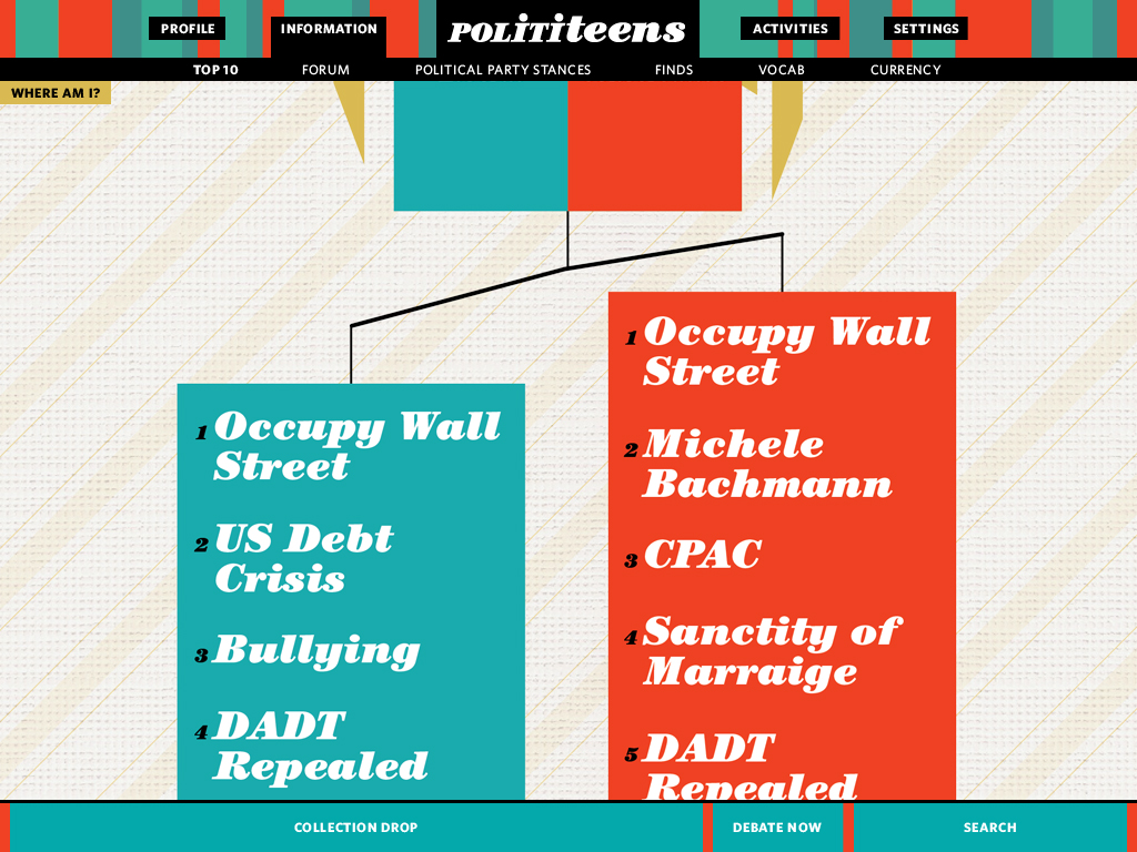
the overview view of the top 10 current topics under the information tab
Branding Style #02: Circle Dive
Honestly, I feel like I really had an epiphany with this direction. You navigate inside the circles, so when you click on a circle you move into it, diving deeper into the subject to get a deeper, more detailed view of the topic. All of the kinks aren't fully worked out, but I feel like this works much better already visually than the first direction.

the main page

the information main page, inside of the information circle from the screen above

the top 10 main page, inside the Top 10 circle from the screen above

here is the conservative page as it looks within the conservative circle from the screen above.

Here's the page if you hover your cursor on the top conservative topic. in the blue circle in the lower right-hand corner, the corresponding number topic of the liberal side shades over and has a "1" put on top of it.
As of now, I'm really leaning towards the second direction(circle dive). Conceptually it makes clearer sense than the first direction(mobile apparatus). Visually its much more cohesive, less gimmick-y, and already so much more refined than the first direction.
 Tags
mx
Tags
mx
10/8/11
design systems. possible saviors.

 Tags
design systems
Tags
design systems
9/30/11
mx. possible inspiration.
http://mashable.com/2011/09/30/twosides/
http://www.twosides.co
From the Mashable link above:
Quick Pitch: TwoSides makes it easy to see every side of an issue and compare viewpoints with others
Genius Idea: See how your viewpoints match up against the presidential candidates.
When you submit a topic, its a very simple process. You write down the issue in a concise, one sentence statement, with the option to include background information on the issue, and press submit. Once you do that you associate your issue with topics. I would almost say you must have "background information" for your issue to be "valid".
One thing I like about this website is the option to put in evidence to back why you agree with an issue. It gives it more validity to your vote than just an opinion. (can we create rewards that help encourage more users to do this?)
But the even nicer thing I like is the "ping" option for when you "know someone [who you think is] better suited to add evidence. perhaps an expert." You simply "ping" them to let them know about the issue. It's a quick way to tell other people in the community of a topic being discussed, and I think is a good example of this. It's quick & straightforward, no need to be bulky and overworked.
Also, the "related issues" is a nice simple way to get other issues(advocations) heard/seen. And the simple, circular infographs aren't bad either. Visuals are always good, no?
What's unfortunate, however, is the "Genius Idea" is 3ish+ clicks deep, and in no way shown how to get to there or that it even exists(unless you love digging around in websites, or read mashable.com)
Some things to possibly help inform decisions about our community and how our community works.
http://www.twosides.co
From the Mashable link above:
Quick Pitch: TwoSides makes it easy to see every side of an issue and compare viewpoints with others
Genius Idea: See how your viewpoints match up against the presidential candidates.
When you submit a topic, its a very simple process. You write down the issue in a concise, one sentence statement, with the option to include background information on the issue, and press submit. Once you do that you associate your issue with topics. I would almost say you must have "background information" for your issue to be "valid".
One thing I like about this website is the option to put in evidence to back why you agree with an issue. It gives it more validity to your vote than just an opinion. (can we create rewards that help encourage more users to do this?)
But the even nicer thing I like is the "ping" option for when you "know someone [who you think is] better suited to add evidence. perhaps an expert." You simply "ping" them to let them know about the issue. It's a quick way to tell other people in the community of a topic being discussed, and I think is a good example of this. It's quick & straightforward, no need to be bulky and overworked.
Also, the "related issues" is a nice simple way to get other issues(advocations) heard/seen. And the simple, circular infographs aren't bad either. Visuals are always good, no?
What's unfortunate, however, is the "Genius Idea" is 3ish+ clicks deep, and in no way shown how to get to there or that it even exists(unless you love digging around in websites, or read mashable.com)
Some things to possibly help inform decisions about our community and how our community works.
Tags
mx
Subscribe to:
Posts (Atom)