I never knew that the Department of Transportation(DOT) called upon AIGA to create the set of directional icons we see everywhere. DOT called upon AIGA to create a universal set of directional/informational icons once they realized that there was a need for them. They compiled a list of images that had been used all across the globe from everywhere from airports to local cities. AIGA selected a team of 5 lead designers to head this project. Once finished they had created a set of 34 icons with 16 more added later. This was one of the first projects that got the Presidential Design Award.
SOURCES: IDSGN, AIGA.
12/23/09
12/22/09
Daily Post. 09. Magazines.
Mag+ from Bonnier on Vimeo.
If you know a little about me, you may know that I love interactive design. That's why I love website design, and this new project. This project excites me more than anything that I've seen in a while. It's a wonderful concept, a digital update to the magazine. The possibilities are endless, and just the simple idea that it is interactive excites me enough. I love packaging design and identity design but the design interactive design is my top favorite now-a-days. Creating something that the human can interact with, play with, alter, change, have a say in.
SOURCES: VIMEO, BONNIER, DESIGNALOGUE.
Website. Layout. Quick update.
This is just a quick update of what i'm working on. I'm sure you can tell from earlier posts what I've been thinking about for inspiration. This is the first stage, created this today. Will hopefully still like it tomorrow.
12/21/09
Daily Post. 08. Grafik.
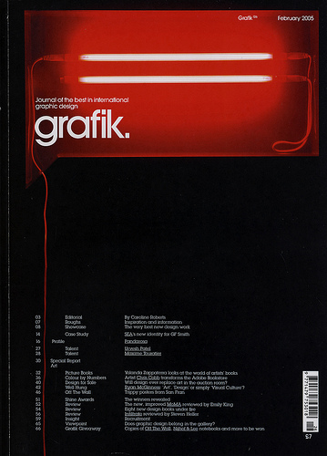
I love these magazine covers. The placement of everything is so very nice. The top has the logo, name placed inside of a speech bubble type shape. Then below it is a list of page numbers, section title, and quick description of that section. It's a beautiful layout. It's a very successful answer to the problem at hand. Plus, all of the magazine covers that I see now-a-days are way to over done, trying to grab your attention, but they are just so ugly. Seeing a magazine like this gives hope to my world that good design really does exist even in such a washed out market like magazines.
Below are links to the website of this magazine, the website I found this cover on along with more covers like it and the wonderful website called Graphic-ExchanGE.
SOURCES: GRAPHIC-EXCHANGE(ORIGINAL POST), GRAFIK MAGAZINE.

Below are links to the website of this magazine, the website I found this cover on along with more covers like it and the wonderful website called Graphic-ExchanGE.
SOURCES: GRAPHIC-EXCHANGE(ORIGINAL POST), GRAFIK MAGAZINE.
12/20/09
Daily Post. 07. TOC.
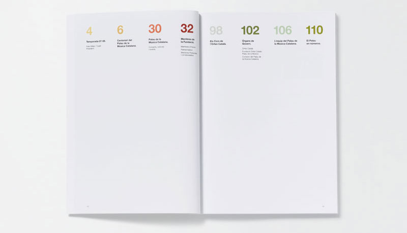
This post will be short. The layout of the table of contents is quite nice. It's a very simple grid with a nice hierarchy of the size of the numbers to the text below it. I looked through the website that this was pulled from, but I cannot find the original article. I would assume that the colors correlate to the different sections which is a simple, yet very successful way to section off information within the book. Plus, my favorite type of design. Clean, simple(at first glance), and successful.
SOURCES: FFFFOUND!, GRAPHIC-EXCHANGE(WHERE ORIGINALLY SPOTLIGHTED).
Subscribe to:
Posts (Atom)